Ascend Payment Systems – Print
If you live in Silicon Valley and are looking for a great merchant services provider.. look no further. Ascend Payment Systems is a new company created by James Hernandez who has many years of experience in the industry.
James contacted me last week about a new logo. He had a few basic ideas in mind and provided me with a basic logo he had already done.
His Ideas:
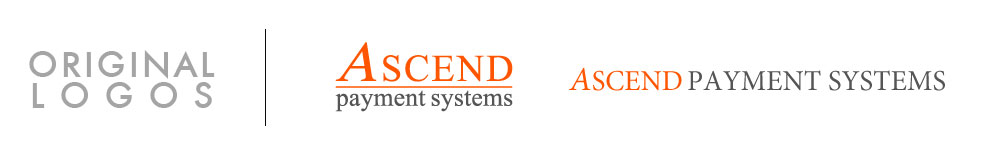
- He wanted the word “ascend” to be orange and “Payment Systems” to be a dark gray.
- He wanted the “A” in “Ascend” to be italicized
- He wanted a strong icon that could be used as a stand-alone logo
Below are the text logos he sent me:
 Drawing from the word “ascend”, my first concepts were different mountain designs:
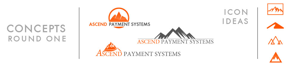
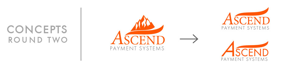
James agreed he also thought of a mountain image… but since there are no mountains in sight from Silicon Valley, we decided it wasn’t the appropriate fit. However, from one of the mountain icons I designed I pulled a small element that still looked nice. It was a left to right, upward swoop and therefore still had a connection with the word ascend. I tried it with a couple of different font styles.
James liked the new font but had another idea for the icon. He wanted to see a check mark as the cross bar in the “A”. I sent him a few variations including a boxed version with the text below.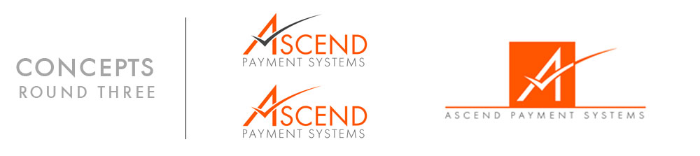
The new design worked well and James was especially happy with the boxed version. He asked to see it in a stacked version with the text stacked to the right of the box which worked out nicely with the check mark also crossing the “A” in Ascend. The box also lead to another idea of making the “A” from white space in the box.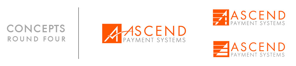
James was liking both of the last concepts and asked for a few variations of color.
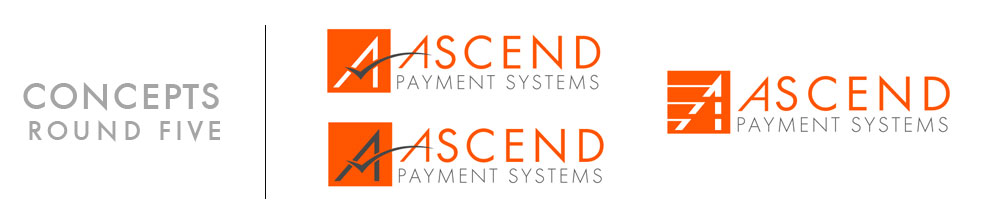 A few more color variations of both concepts.
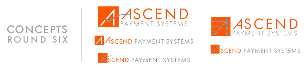
The boxed “A” using negative space won out and a couple of further color variations were requested. We also started looking at a horizontal version in case one was needed for certain applications. 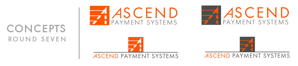
James made the final decision to go with the dark gray box and the “A” in orange. 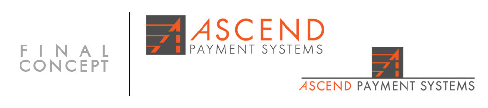
Total time to create the finished logo from our first communication to final print-ready designs sent to the client: 6 days.
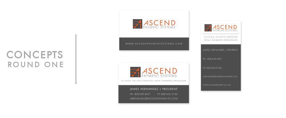
Business Card:
Once we finished the logo James wanted to see a few ideas for a business card. The only input he had was that he wanted a 2-sided card.
 After the first concepts, James asked to see a few variations of the landscape layout.
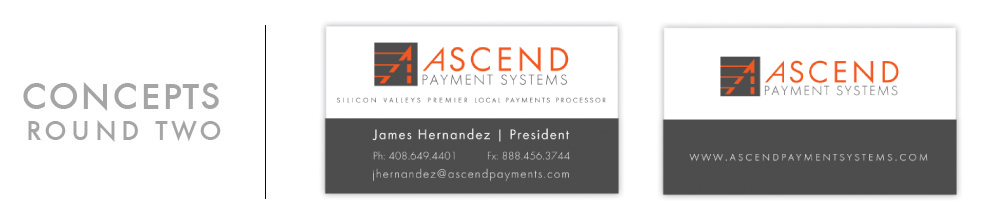 James asked if the dark gray strip could be thinner and move his name into the white space.
James decided that he liked the portrait layout better after all and asked to see a couple more variations.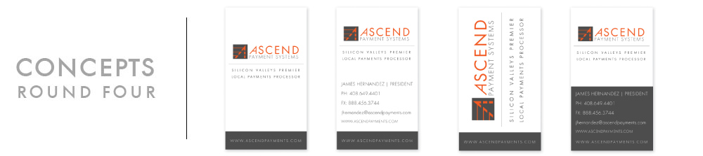
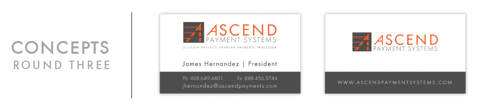
We were able to decide on the content and I gave him a couple more options.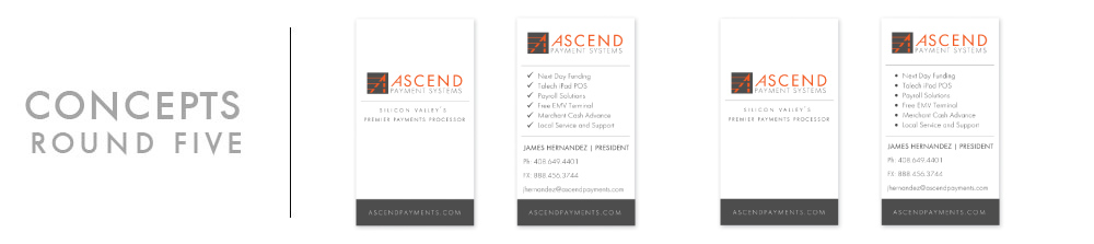
He decided on the check mark list and asked to split the information between the 2 sides. Below is the final proof sent to press. 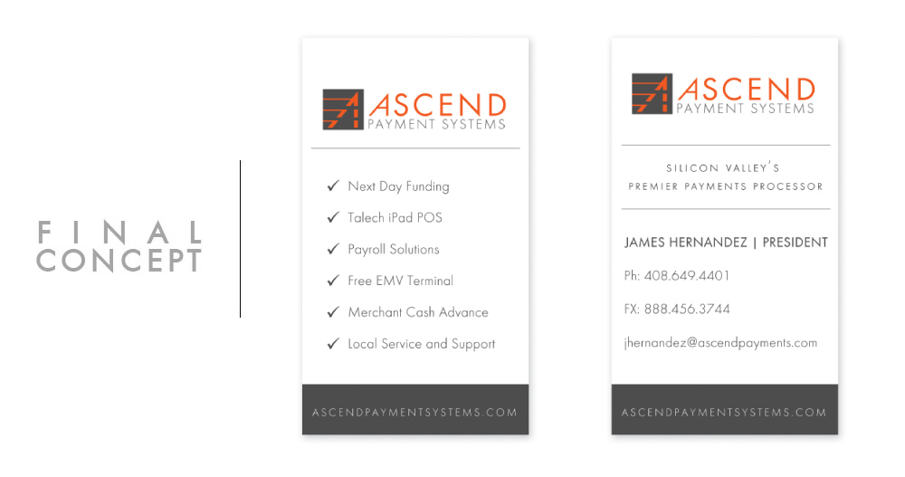
Total time from the first concept to final artwork sent to printer: 5 days.
Brochure:
Next project was a brochure.
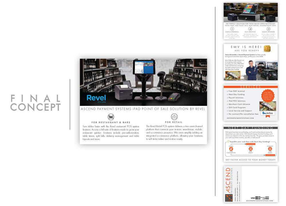
Total time from the first concept to final artwork sent to printer: 3 days.
Stay tuned for the next post featuring Ascend Payment Systems website and social media projects.