-
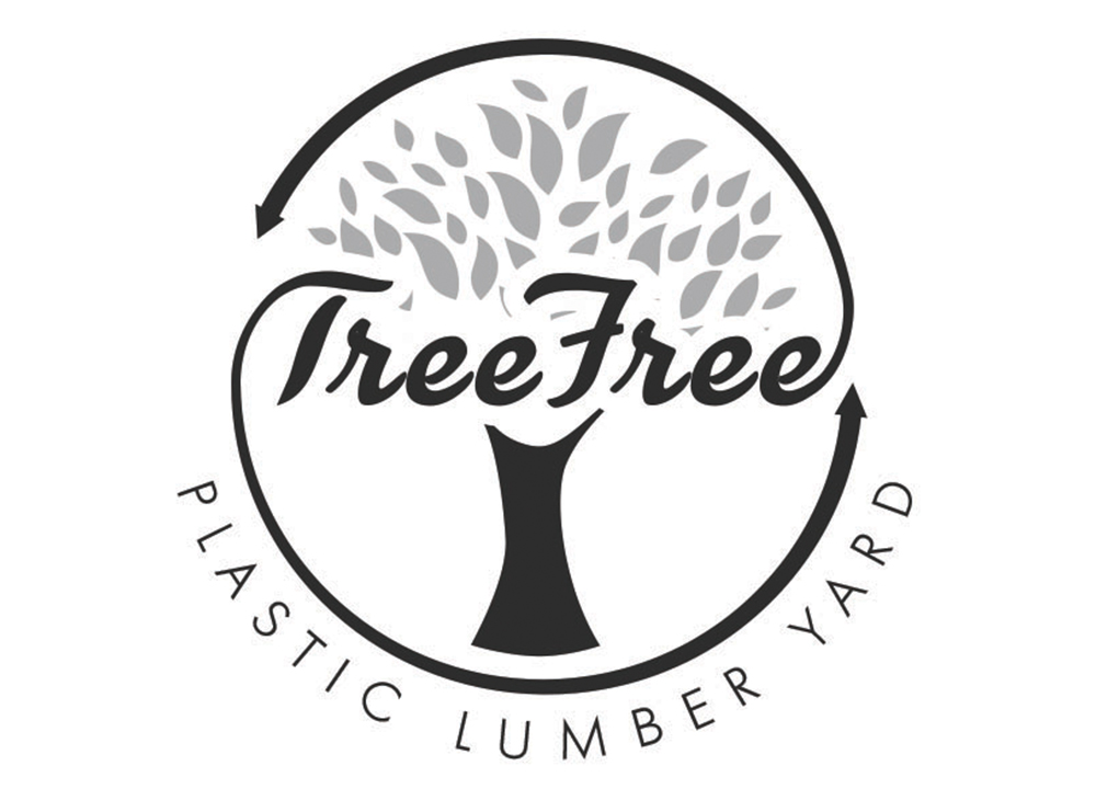
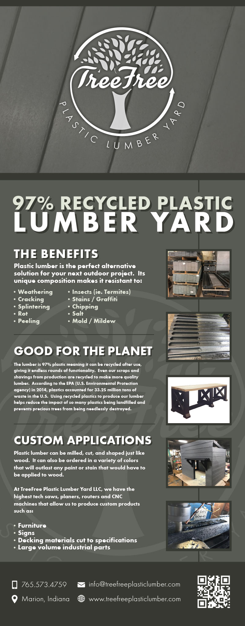
Tree Free Plastic Lumber Yard
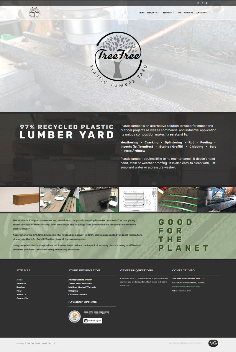
This family-run business decided to step up their game with a whole new branding package. We started with a new logo, for which they already had great ideas in mind. Once that was settled we moved on to their business cards, website and social media page. After the fact, they called back for a trade show banner. -
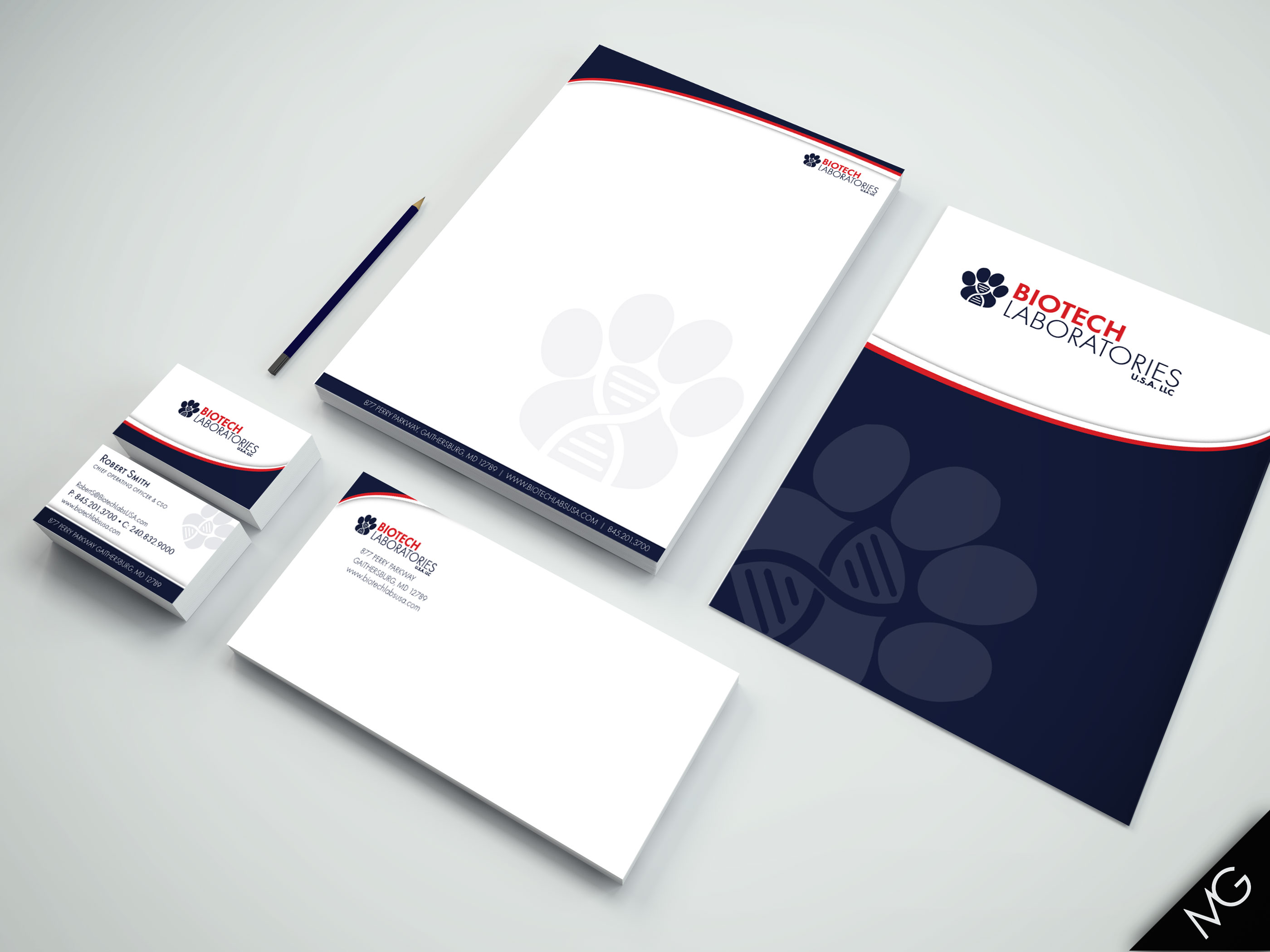
BioTech Laboratories
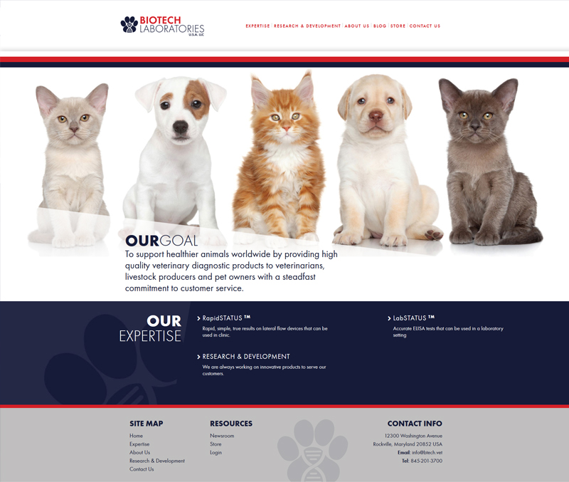
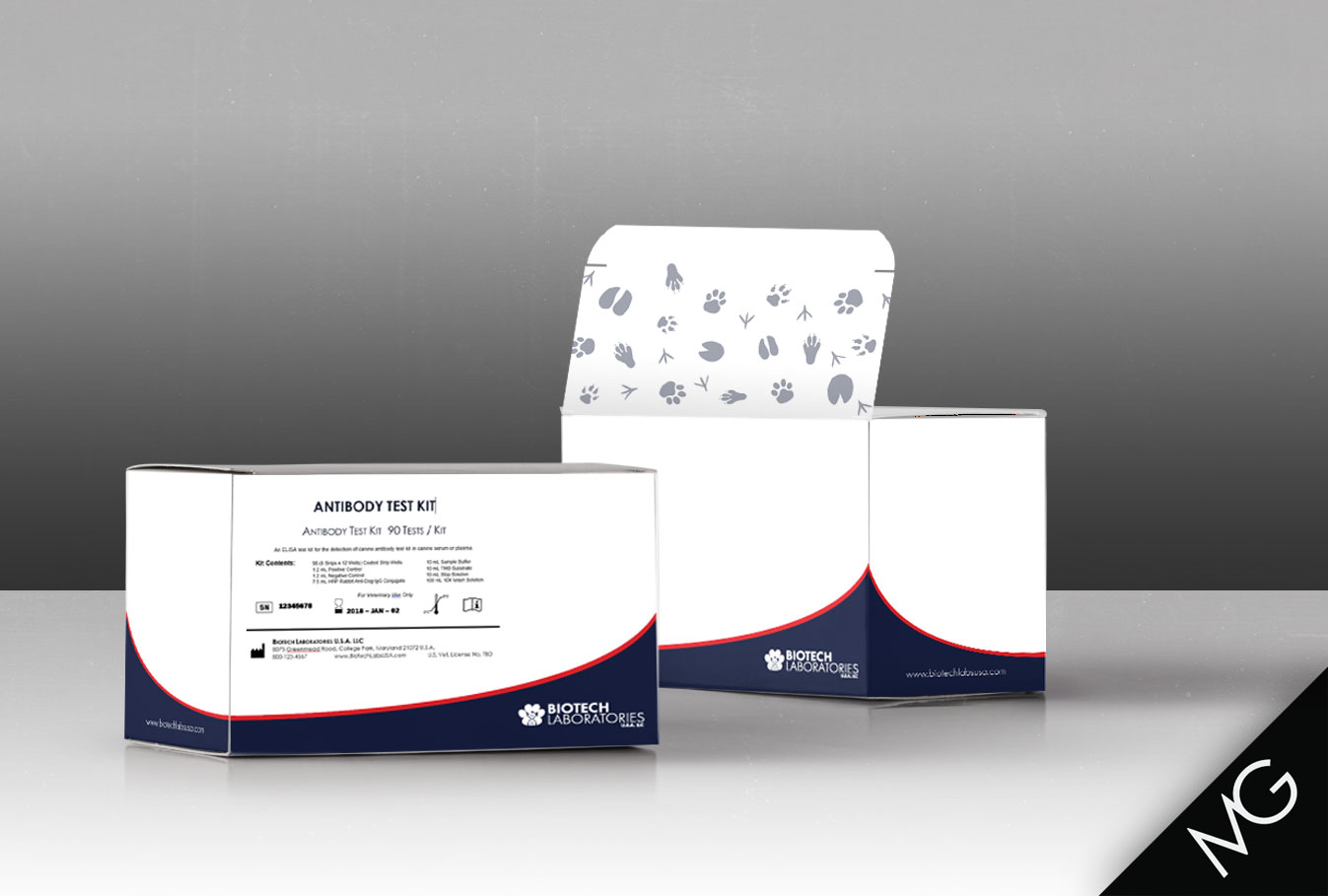
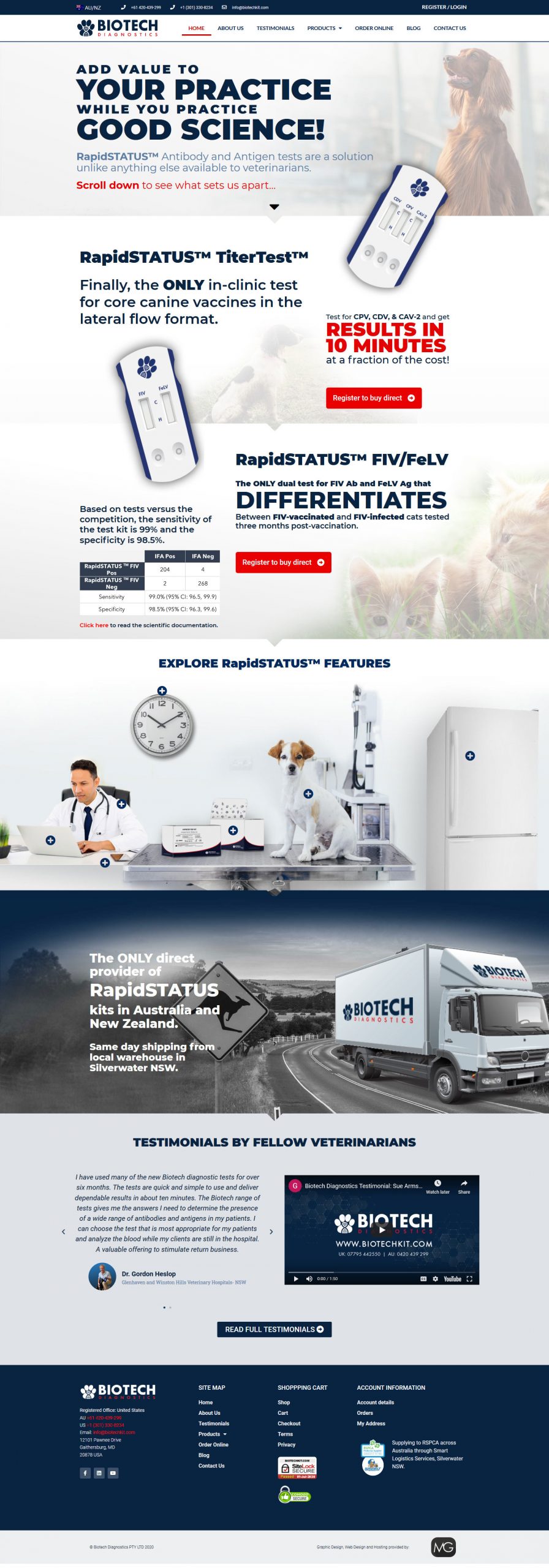
Sarah from BioTech Labs submitted a logo design contest on zilliondesigns.com for their new veterinary lab company. They make blood tests for various animal diseases and wanted their logo to reflect that. Since \"U.S.A.\" is in their name they wanted to go with the red, white and blue color scheme. Of over 100 logo concepts submitted to the contest, I am honored they selected my design! Once they selected the logo they contracted my services to design their business cards, letterhead, website, and product packaging. -
Storm Electrical
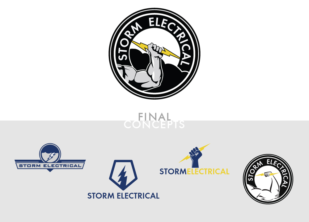
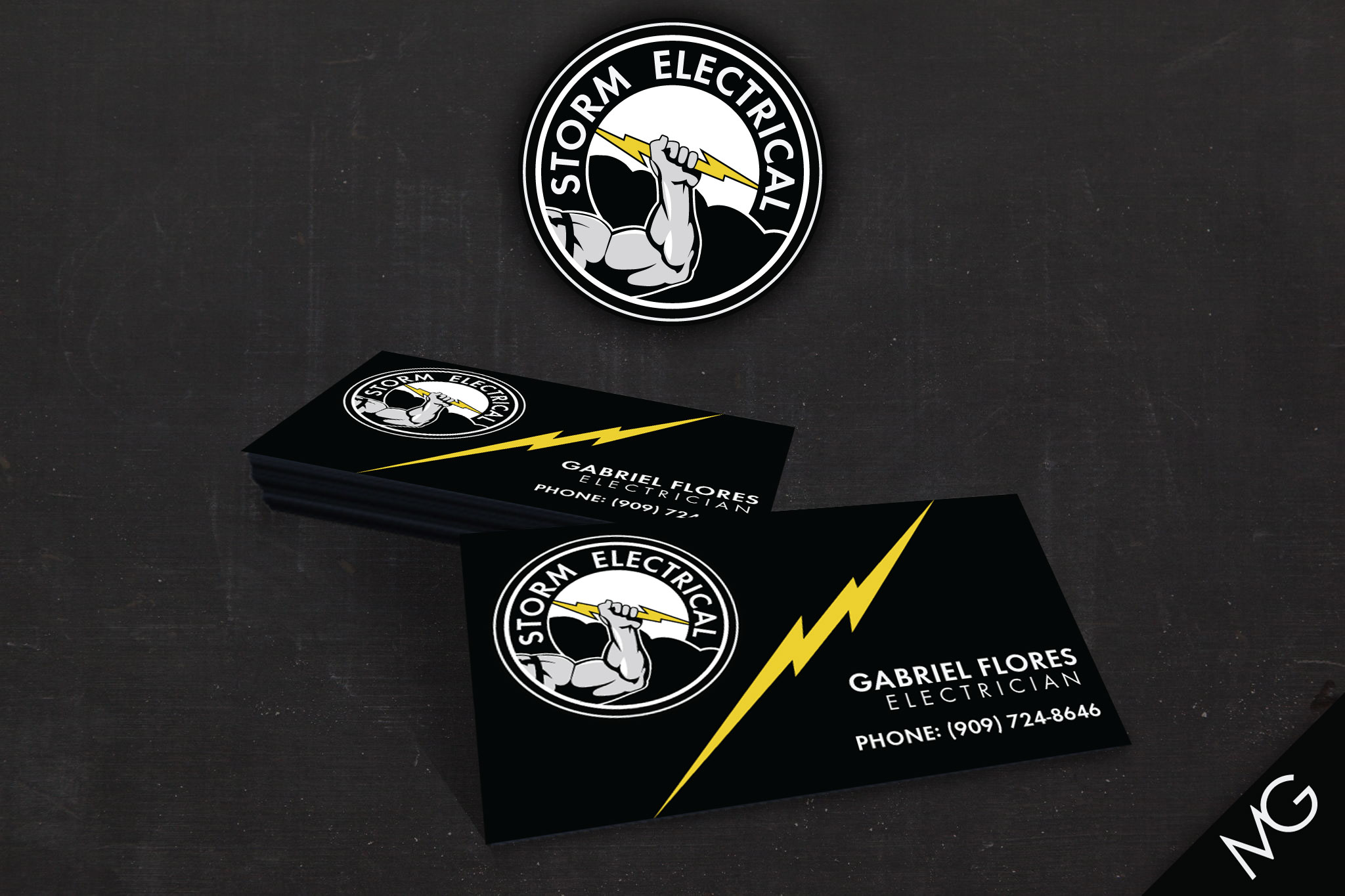
This client needed a logo and business card for their new electrical company. They had the initial idea of a cloud and lightning bolt. That idea then morphed into a hand holding the lightning bolt and later a muscular arm. A circle format was chosen for easy use on social media, web and print outlets. The final logo includes both the cloud and arm concepts in a bold, simple design. The business card design follows the same bold & simple format using the lightning bolt from the logo to dinamically devide the space between the logo and the information. -
J-4 Professional Cleaning Systems
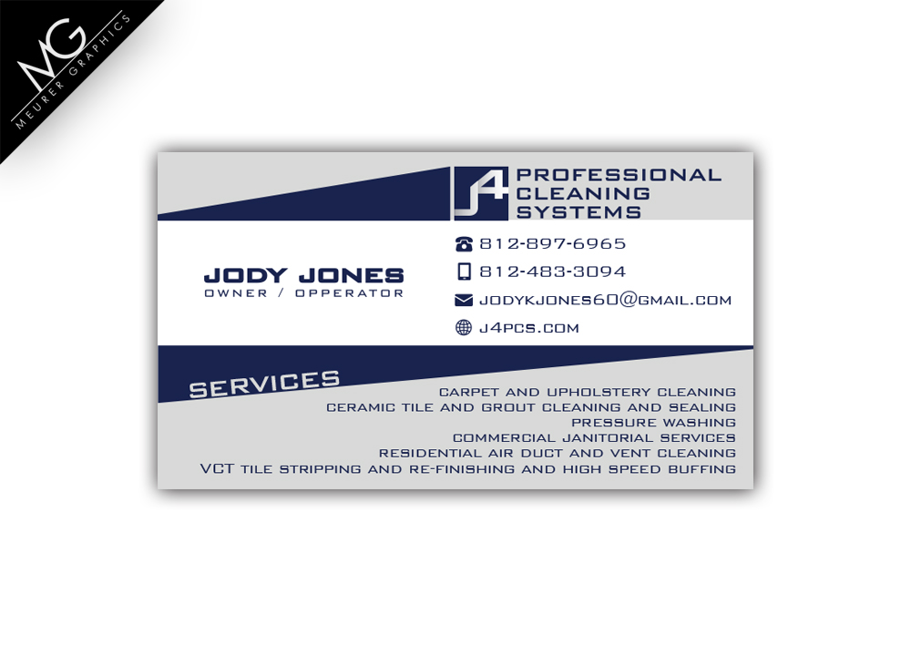
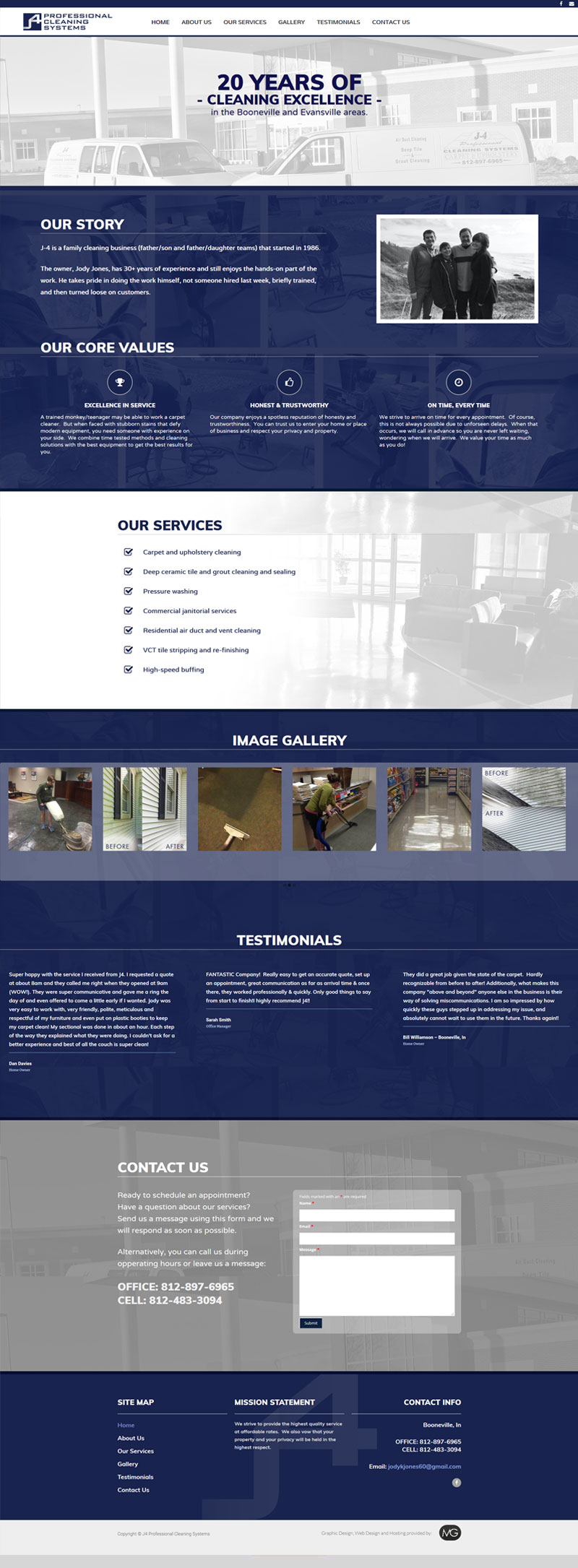
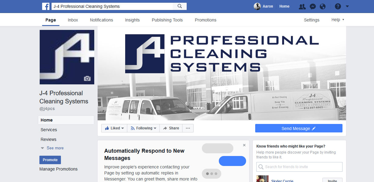
Jody and his team have over 20 years of professional cleaning experience, but his brand didn\'t reflect that. Together we created a new logo, then business cards and a website. We also created a facebook page for J-4 to bring the business into the social age. Jody later told me that shortly after everything went live, he had a client drive to his location to see if it looked like a legitimate operation. He found J-4\'s website on google (which wouldn\'t have been possible a month earlier) and upon arrival saw that the vans and place of business looked just like on the site. He hired them on the spot and has been a loyal customer ever sense. -
Greenleaf Bookkeeping Solutions, LLC
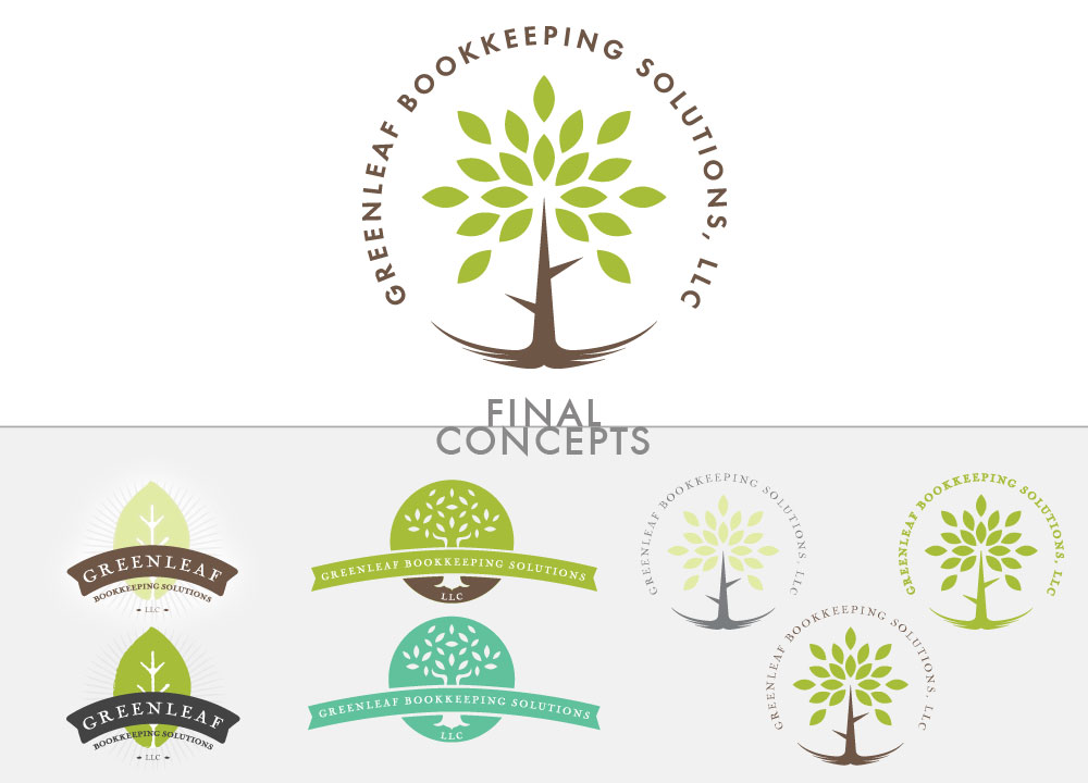
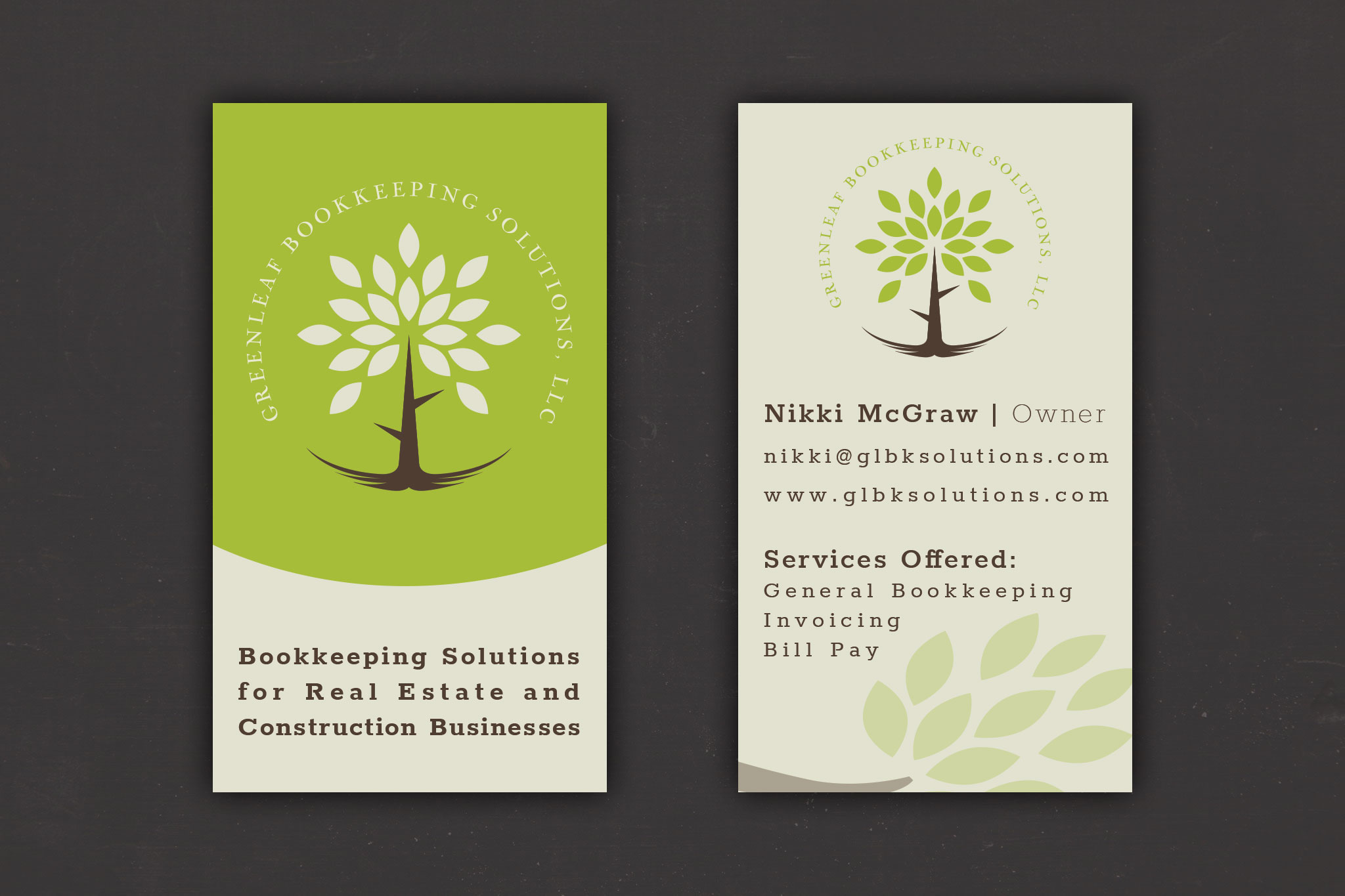
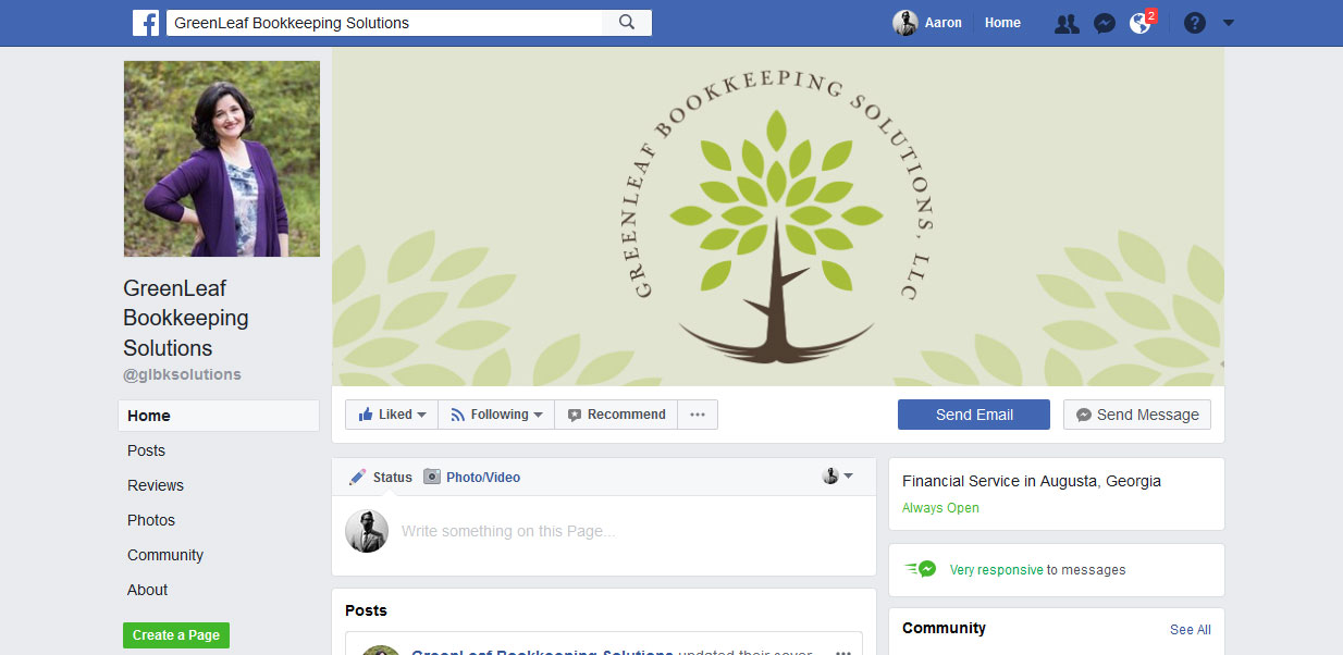
Nikki first requested a logo for her new bookkeeping business. She had a concept in mind having to do with tree roots indicating that she helps her clients be financially rooted to weather the storm. The tree root concept should also tie in the Greenleaf name. I developed 3 initial designs for her to choose from. She connected with a circular design including an entire tree, leaves to roots. From there Nikki requested business cards and a website to match her new logo. She wanted a clean modern look that would be easy for clients to read and understand. We were quickly able to accomplish that look on booth the site and card. For the website we decided to go with a modern single scrolling page. Development only took a few days to Nikkis surprise. The website can be seen at http://greenleafbookkeepingsolutions.com/ -
Ascend Payment Systems
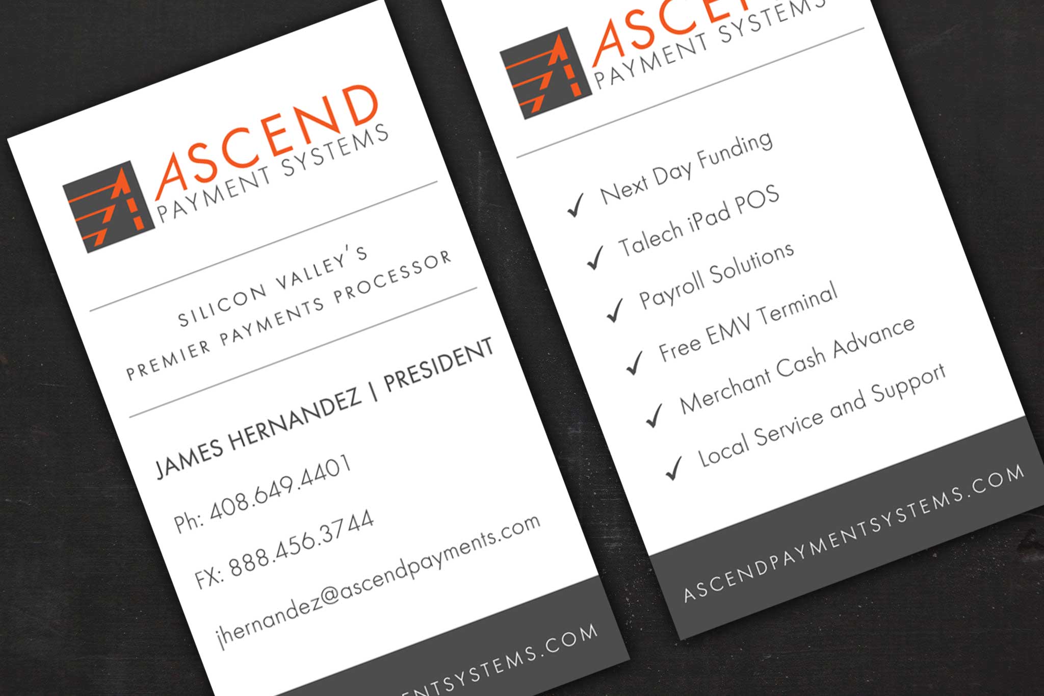
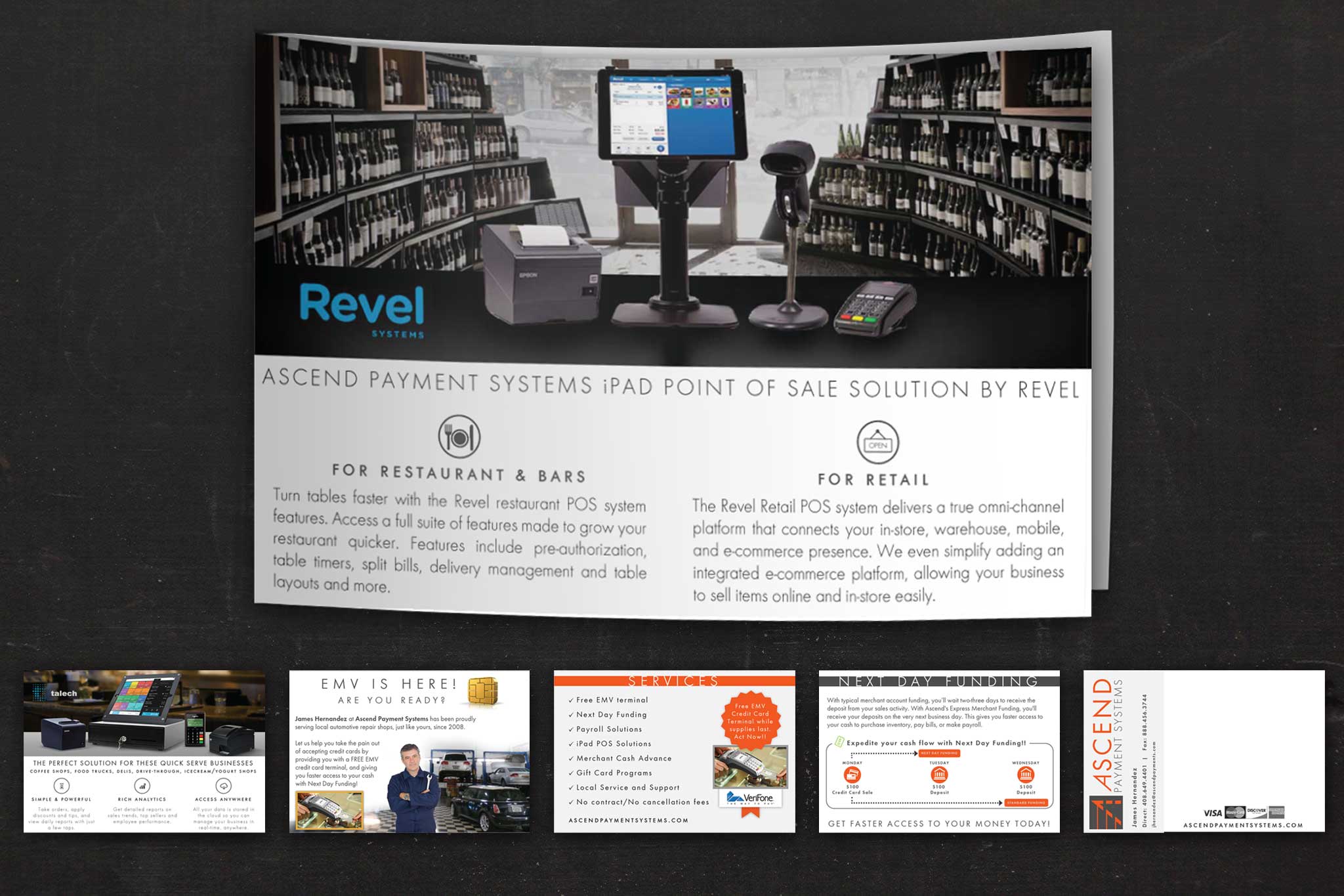
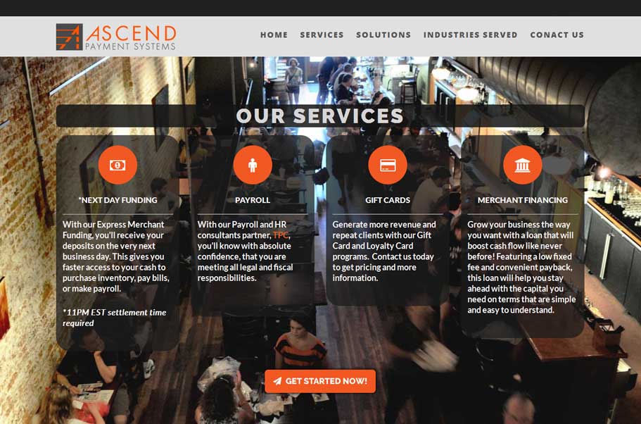
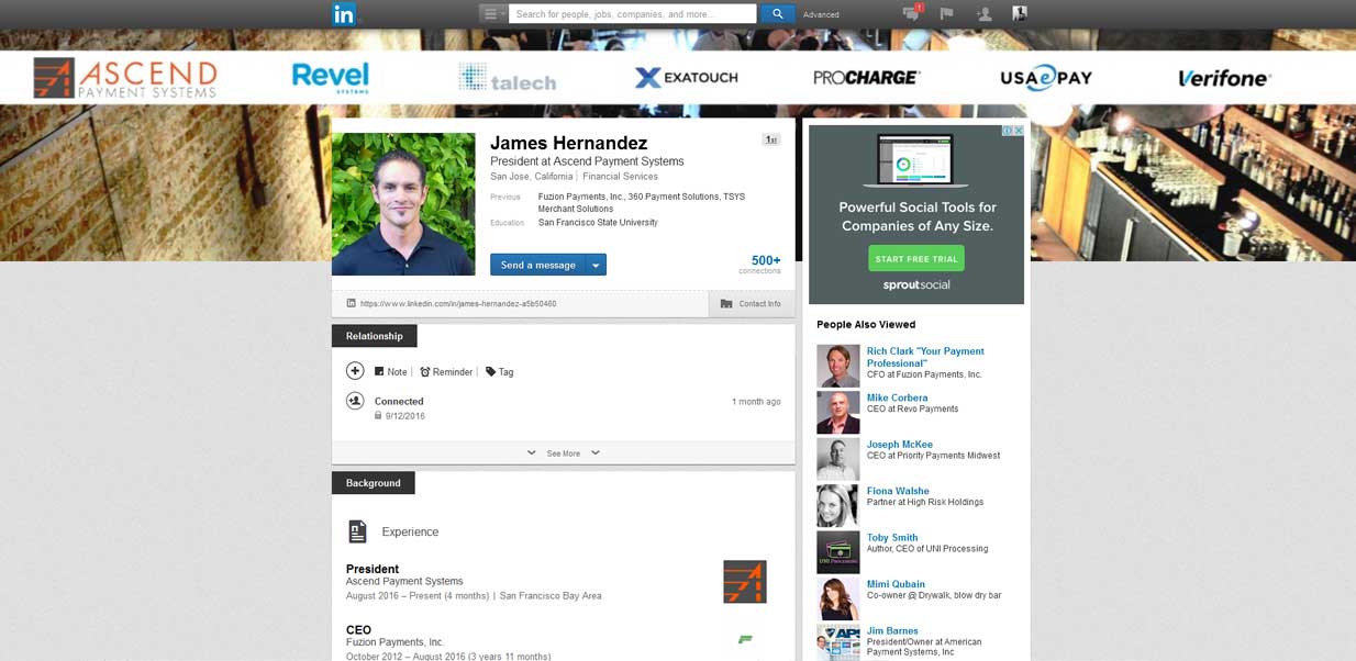
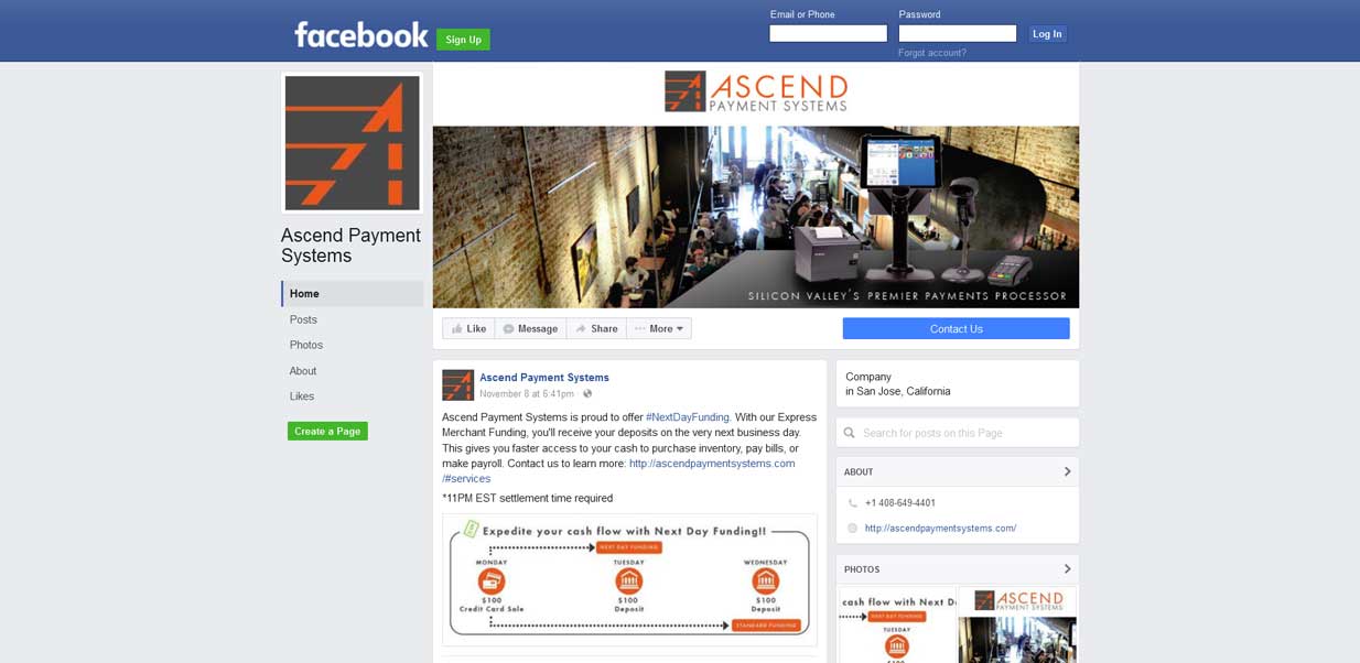
James contacted me needing a logo and graphics for his new merchant services business. He knew what colors he wanted to use... and that was about it. After several concepts, we found the perfect look for the logo. Once that was established we quickly produced, business cards and brochures to match his new look. James was so happy with his logo and print items he decided to have me design his website as well. He knew he wanted a single long scrolling web page and provided me with sources for the content. Within a couple of weeks and a number of revisions, we finished up the site and James is ready for business! I also designed his social media profile images and he is using my social marketing management services. For details about this service, visit the contact me page of this site and send me a pricing request. -
PEP Organizing
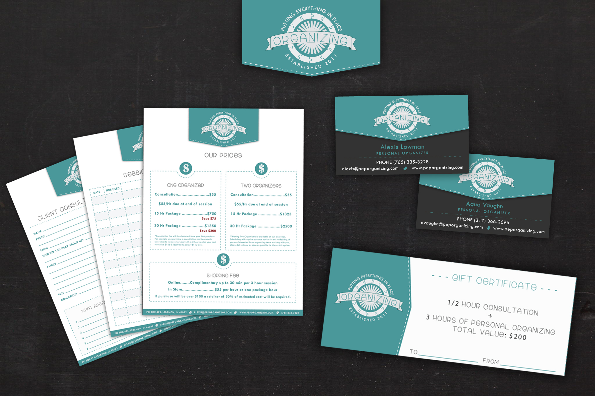
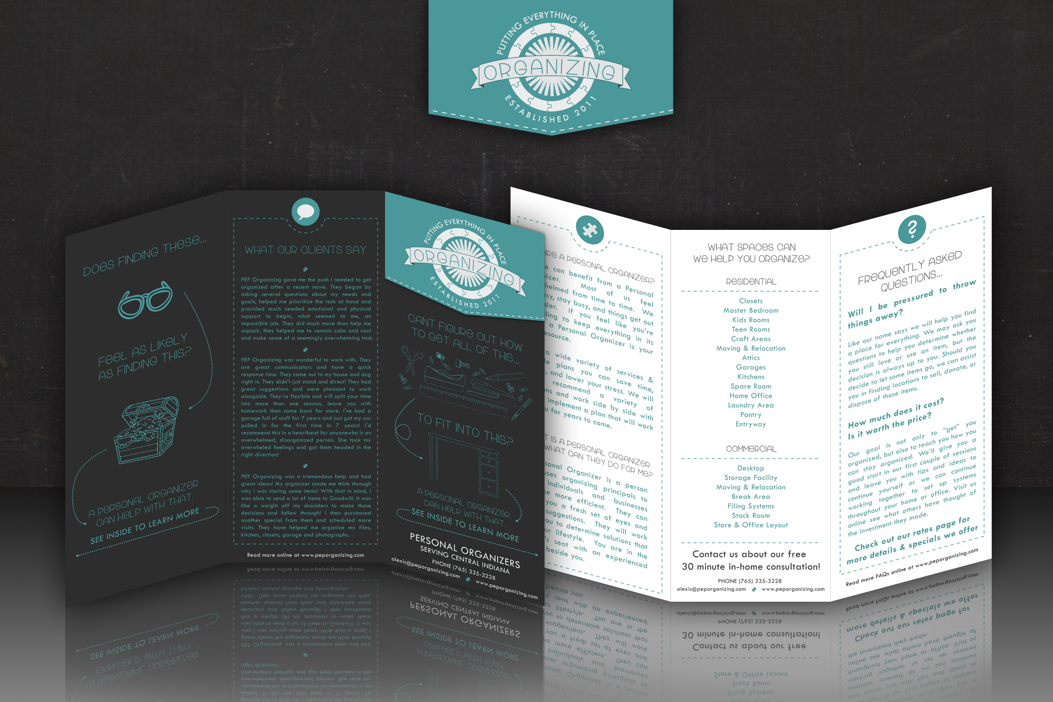
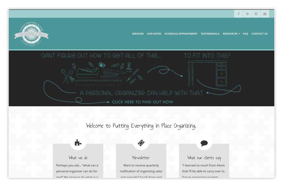
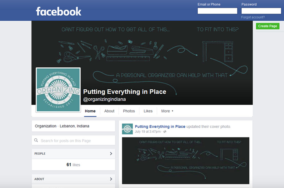
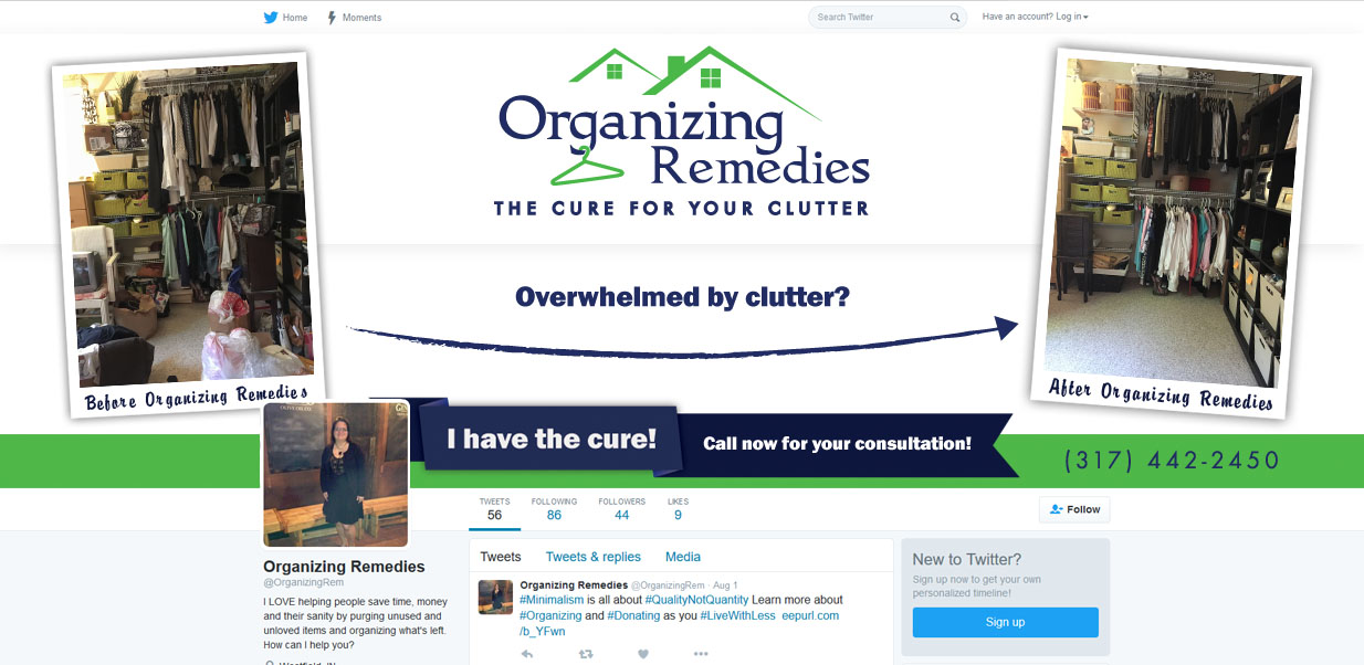
This client needed a total redesign of her logo and an update of all of her other marketing materials, web site and social media to match. Before, she was using several different clip art logos with no continuity between mediums. Her business card had one logo/style, her web site looked totally different, and her social media different still. She also has many printed documents that she shares with each client and none of them were branded other than having her name in plain type at the top. Based on our conversation with her, we quickly created a logo concept that was exactly what she was looking for. Once we settled on the logo design, we were able to maintain that brand image across all of her documents, web site and social media outlets. Here is what the client had to say upon project completion:I wish I would have hired them sooner! They’ve hosted my website for almost 5 years, but I’ve been afraid of the cost of a graphic designer & tried to do it myself for far too long. I didn’t know exactly how to describe what I wanted, but Aaron asked great questions, gave helpful input & seemed to understand what I wanted, despite my vague answers like – ‘I’m not sure, I just want it to look professional’. In a matter of days he had most of my new site complete, he thought of great ways to express the mood I wanted for new customers – Professional & Approachable. I love it! Not only does he have the technical skills necessary he also seems to have the ability to understand & deliver exactly what I want – not just a generic service. I will highly recommend him to others looking for web design & will happily continue to use his service.
Alexis L. - Owner - PEP Organizing -
Your Assistant
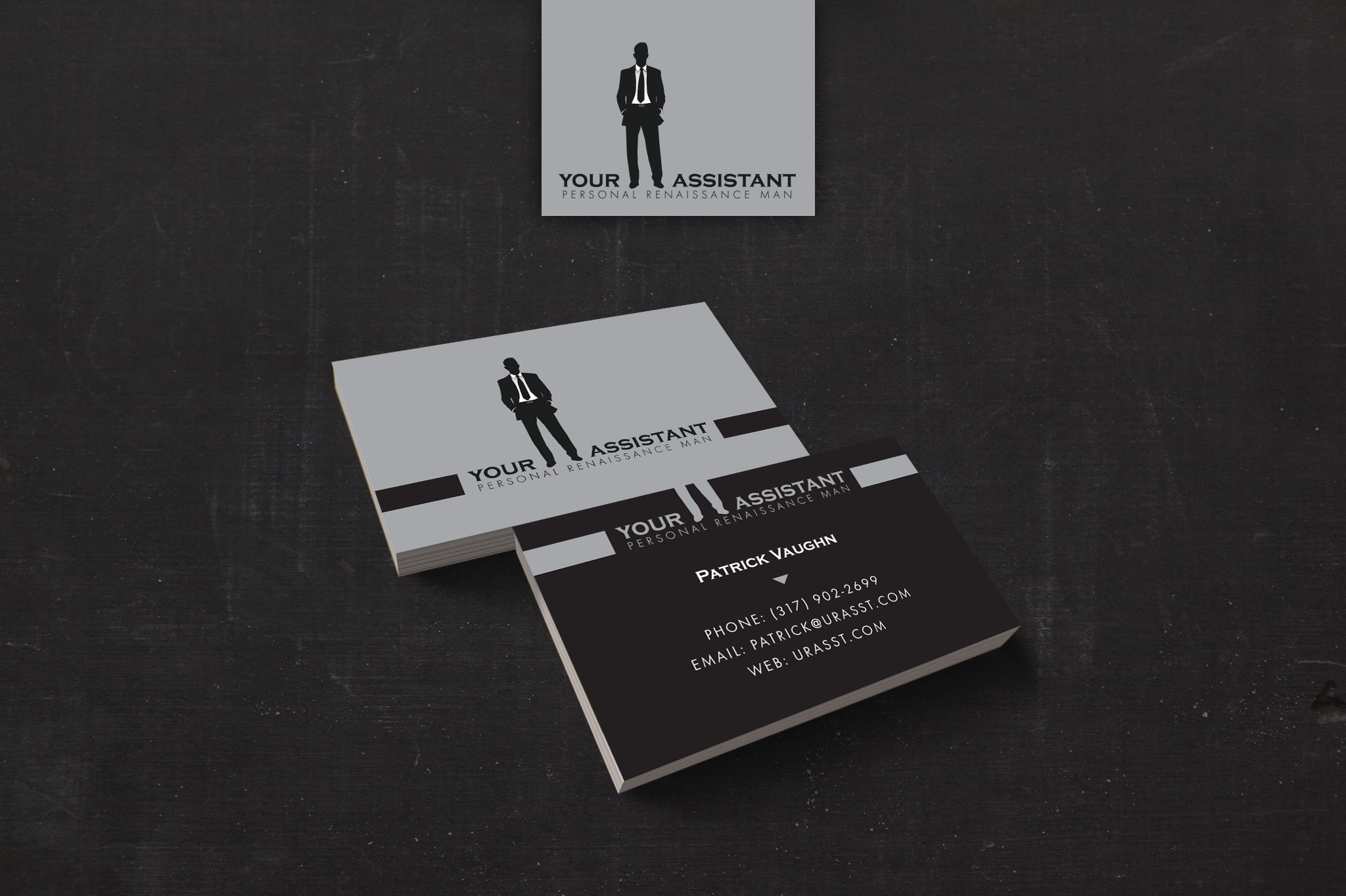
Your assistant is a new service based business offering personal assistance in a slew of professional fields. The entrepreneur behind the idea is the kind of guy who shows up to repair your printer in a 3 piece suit. He needed a logo that conveyed that. Someone of his varied talents reminded me of a modern renaissance man, and thus the Personal Renaissance Man slogan was born. The simple grayscale logo and business cards create an easily recognizable brand and a strong first impression. -
DL Remodeling
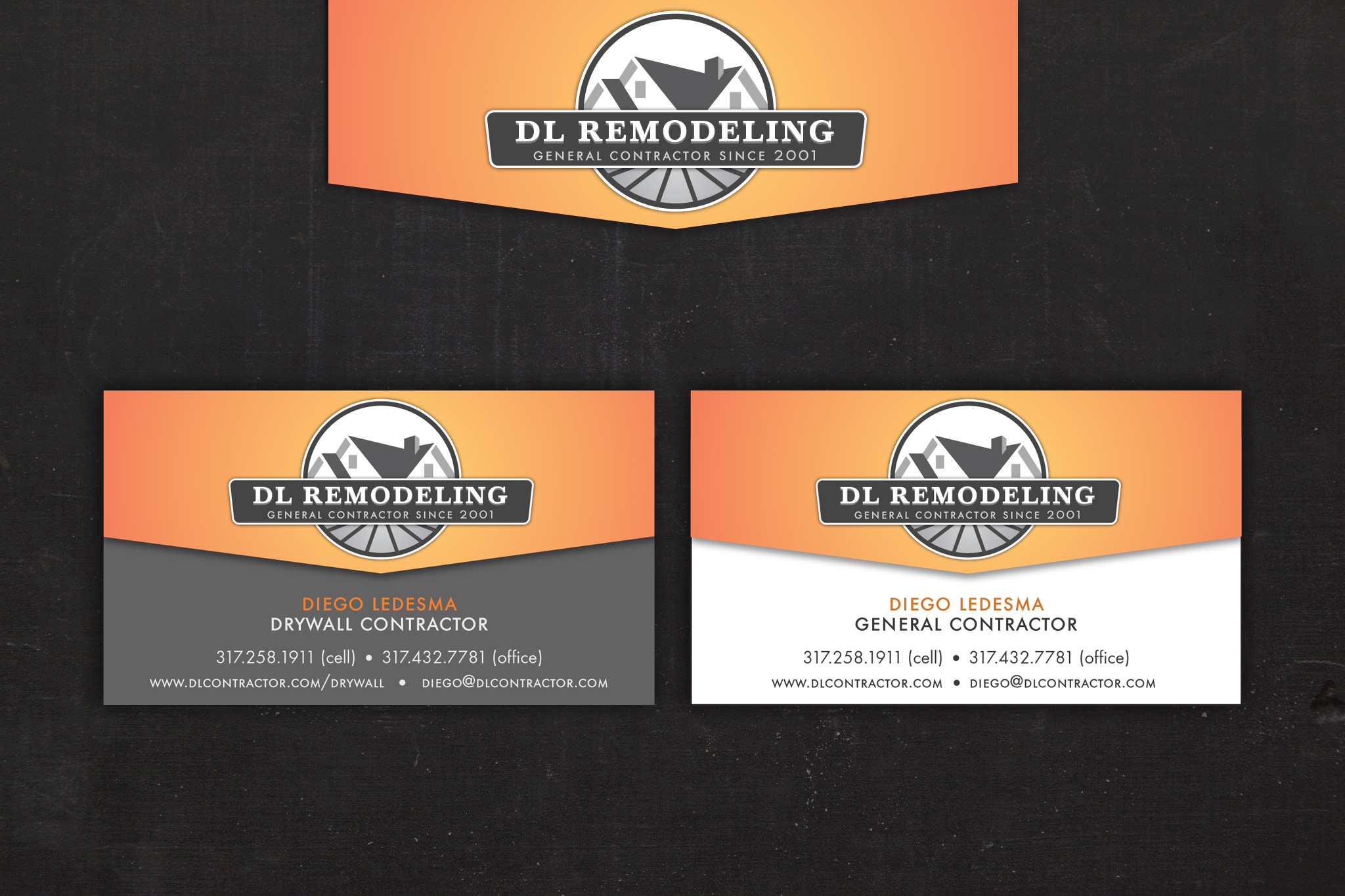
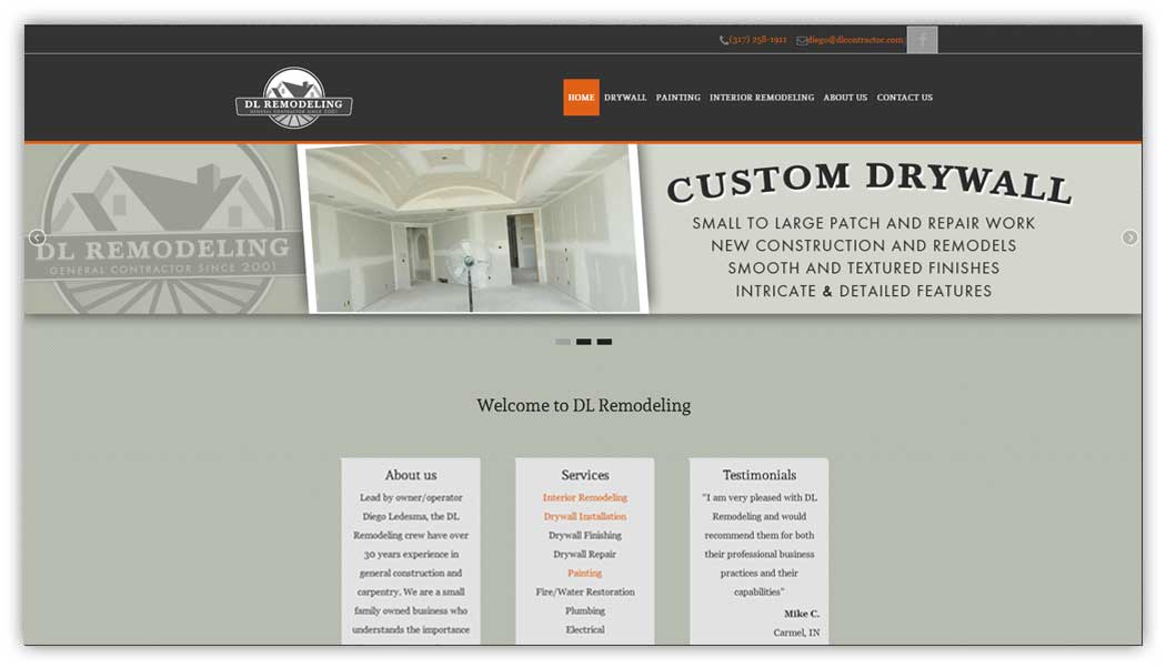
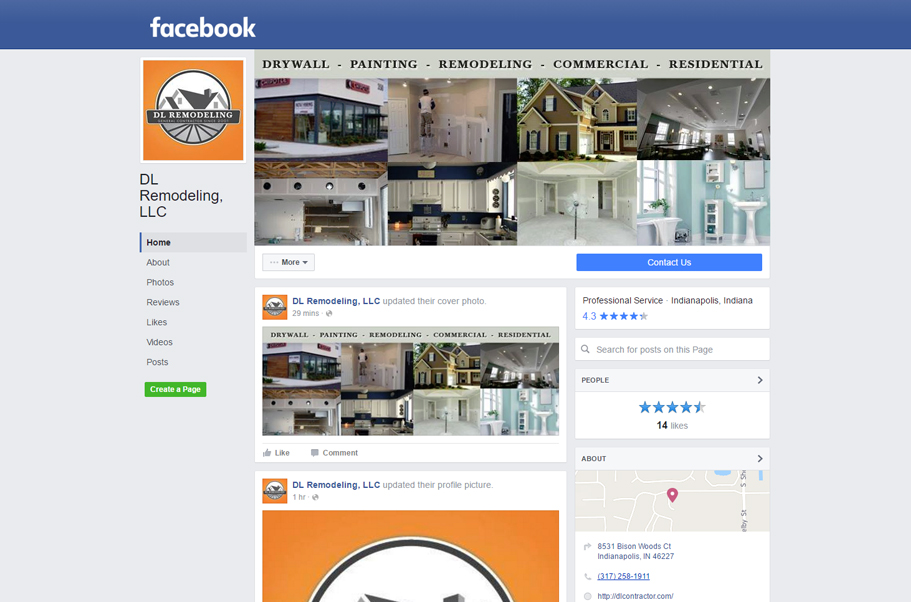
DL Remodeling asked for a new web site, but when we started talking about the look and color scheme, I sold them on a complete redesign of their logo and over all brand. We also updated their business cards. -

Web Design
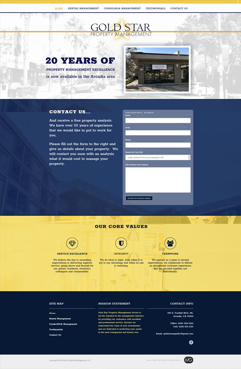
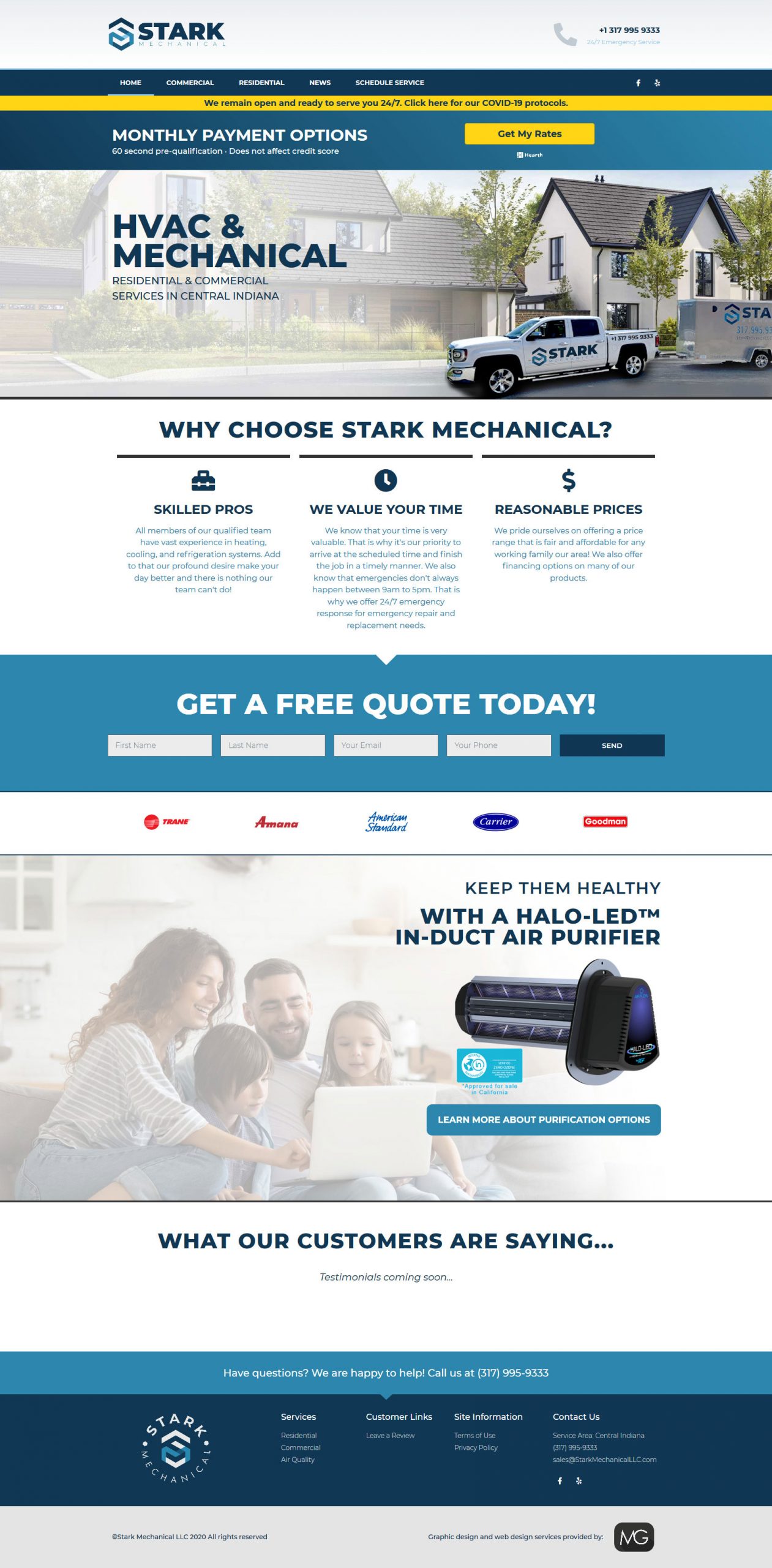
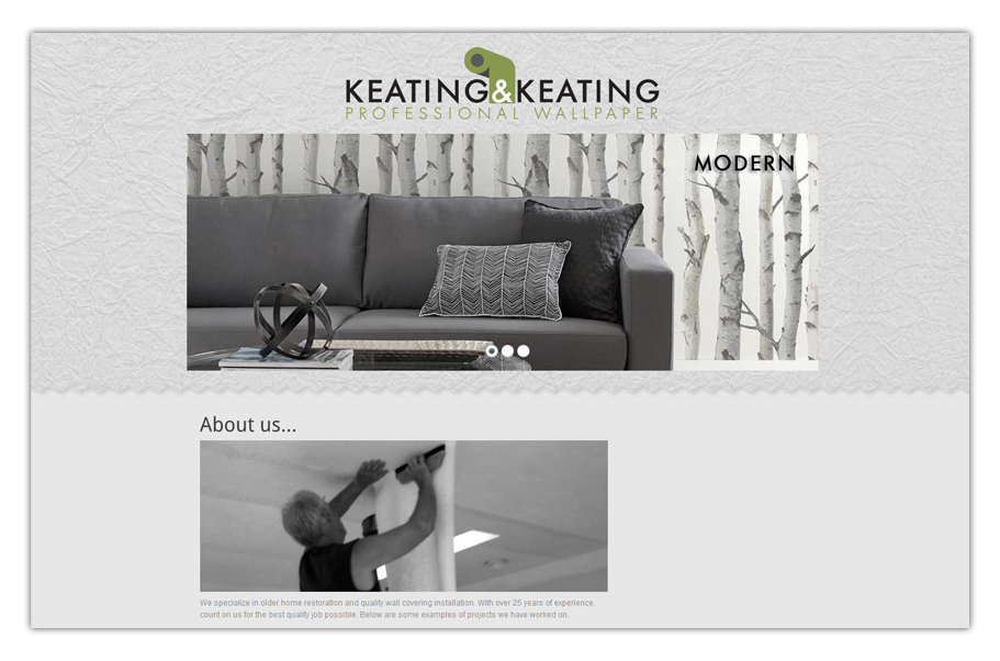
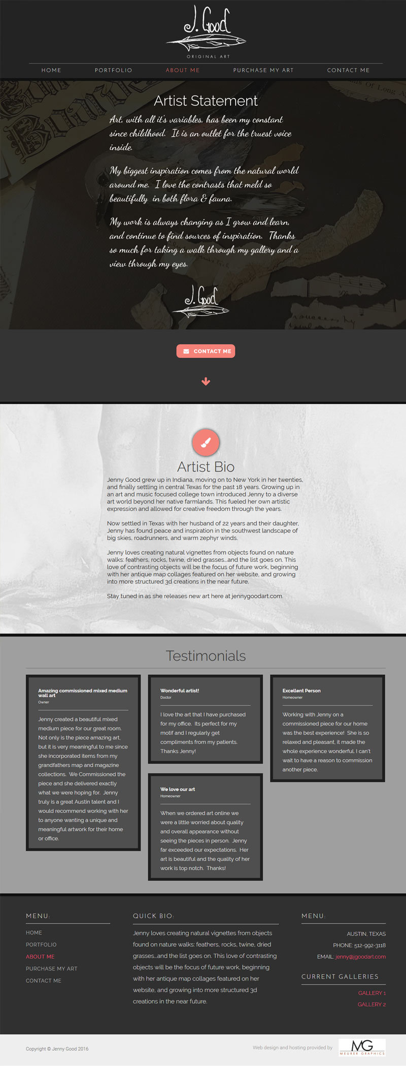
Web design has changed dramatically over the last 10 years! These days your site needs to look good on a number of different screen sizes and devices. Some technologies that were popular just a few years ago are now obsolete due to the fact they aren\'t compatible with mobile devices. If your site was built over 5 years ago, its very likely that you need to update to be compatible with all types of devices. Otherwise, your potential clients may arrive at a blank page or an error when visiting your site. If you are needing a website built from scratch, we will use the latest technologies that allow for easy updates in the future. Here are a few sites I have completed recently: Biotech Diagnostics
Biotech Laboratories LLC
Action Custom Straps
Stark Mechanical
PEP Organizing
Jenny Good Art
DL Contractor
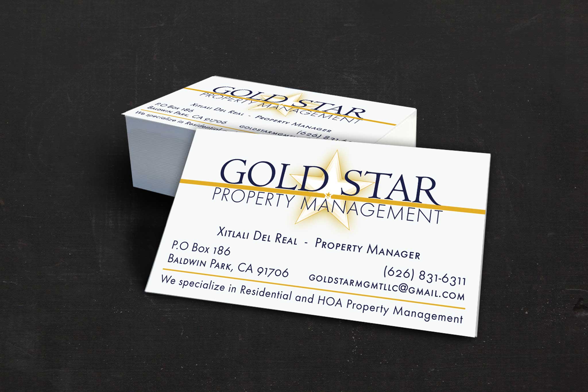
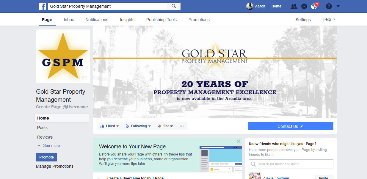
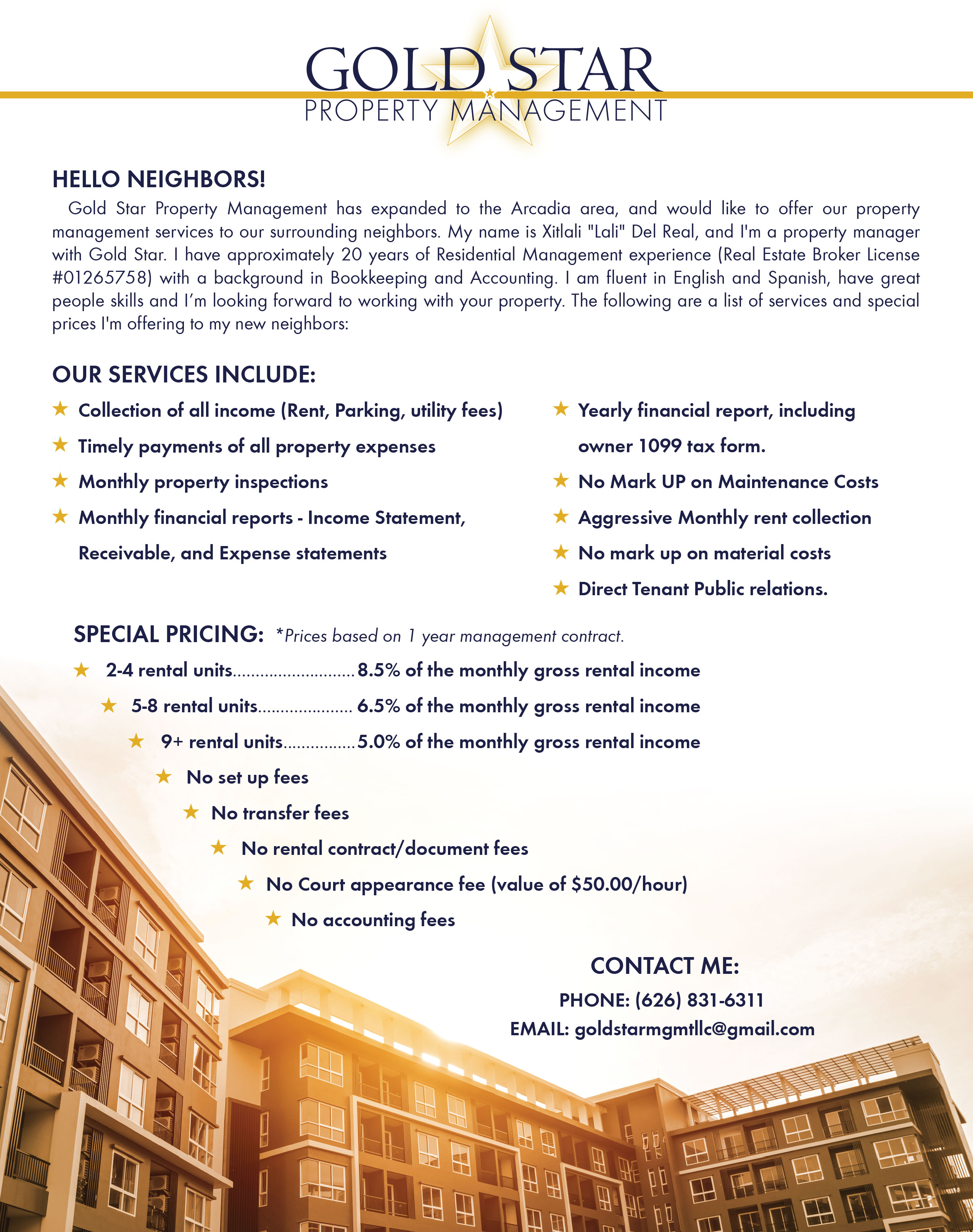
Gold Star Property Management
Greenleaf Bookkeeping Solutions
Keating & Keating


